How to Use Pivot Tables in Google Sheets in 2026
Data grows fast, and simple tables often fail to give clear insights. You need a smarter way to organize and understand your data. Pivot tables in Google Sheets help you turn raw numbers into meaningful summaries within seconds. You do not need advanced skills to use pivot tables. Anyone can learn them with a few simple steps and a clear process.
They help you group data, calculate totals, and spot patterns quickly without complex formulas. For example, you can track sales by product, review monthly expenses, or analyze student marks with ease. In many cases, this data comes from different platforms, and connecting those sources through API and webhook integration makes the analysis more accurate and easier to manage. This guide will walk you through each step in a simple and practical way, so you can use pivot tables confidently on your own data.
What Is a Pivot Table in Google Sheets?
A pivot table in Google Sheets helps you organize and summarize large data sets. It turns raw data into clear and useful information. You can group values, calculate totals, and compare results easily. Instead of scanning long rows, a pivot table shows a quick summary. You can see totals, averages, or counts with just a few clicks. This makes data analysis faster and easier.
Why Use Pivot Tables?
Pivot tables help you analyze large data sets quickly and clearly. They turn messy data into simple summaries you can read fast. This saves time and reduces manual work.
They remove the need for complex formulas. You can change results with a few clicks. This makes reporting faster and more accurate.
You can use pivot tables for many tasks, such as:
These benefits help you understand your data better. You can make decisions based on clear insights instead of guesswork.
When Should You Use a Pivot Table?
You should use a pivot table when your data feels too large or hard to read. It helps you turn raw data into clear summaries. This makes analysis faster and easier. A pivot table works best when you need quick insights without complex formulas. It helps you organize data and focus on what matters most. You can change views anytime without editing the original data.
You can use a pivot table in situations like:
For example, you can track sales by region or check monthly expenses. This helps you understand your data and make better decisions.
Step-by-Step: How to Create a Pivot Table in Google Sheets
Creating a pivot table in Google Sheets is simple when you follow the right steps. You do not need advanced skills or formulas. Just prepare your data well and follow each step carefully.
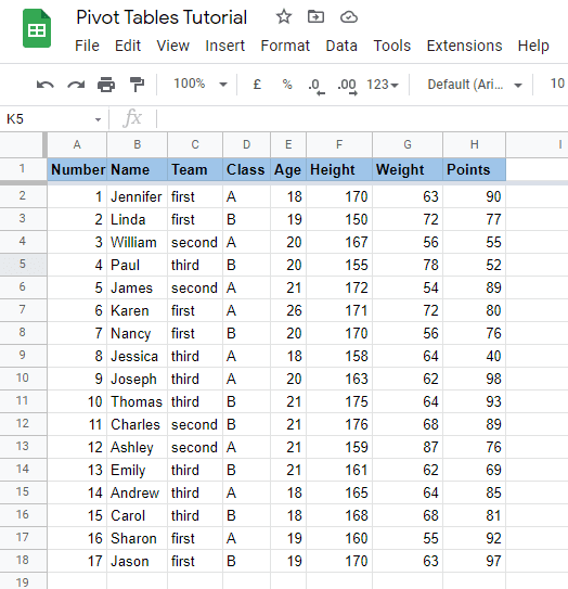
Step 1: Prepare Your Data Properly
Start with clean and organized data. Each column should have a clear header. Avoid empty rows or mixed data types in one column. Make sure your data looks like a proper table. For example, keep columns for product, date, and sales. Clean data helps your pivot table work correctly.
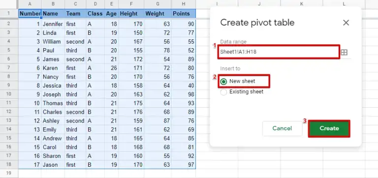
Step 2: Select Data Range
Select all the data you want to use. Include headers in your selection. This helps Google Sheets understand your data structure. You can click and drag to select the range. Make sure you do not miss any rows or columns.
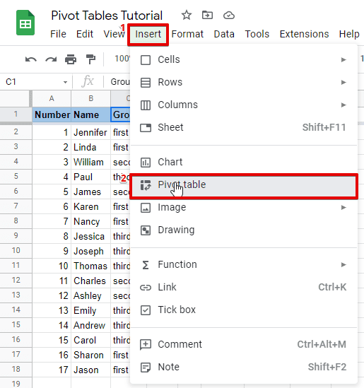
Step 3: Insert → Pivot Table
Go to the top menu and click on “Insert.” Then choose “Pivot table” from the dropdown. Google Sheets will open a setup window. This step creates a new pivot table based on your selected data. It also opens the pivot table editor on the right side.
Step 4: Choose Location
You will see two options for location. You can place the pivot table in a new sheet or an existing sheet. Choose “New sheet” if you want a clean workspace. This keeps your original data safe and separate.
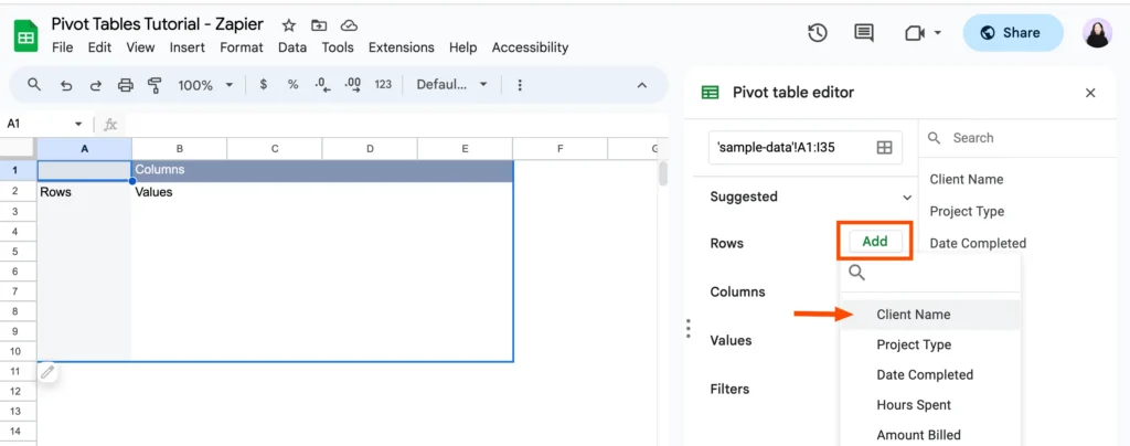
Step 5: Add Rows, Columns, Values
Now comes the most important part. Use the pivot table editor to build your table.
For example, if you add products in rows and sales in values, you will see total sales for each product. This helps you understand your data quickly and clearly.
Understanding Pivot Table Fields
Many beginners feel confused when they see pivot table fields for the first time. The names look simple, but their roles are not always clear. Once you understand these four parts, pivot tables become easy to use.
Each field controls how your data appears and how results get calculated. You can mix them in different ways to create useful reports. The table below explains each field in a simple way.
| Field | What It Does | Example |
|---|---|---|
| Rows | Shows main categories in a list | Product names |
| Columns | Groups data across the top | Months or years |
| Values | Calculates numbers like sum or count | Total sales |
| Filters | Lets you show specific data only | Show one region |
Rows help you organize data into clear categories. Columns help you compare data across different groups. Values perform calculations and show results. Filters help you focus on specific data without changing the full dataset. For example, you can view sales for one month or one region. This makes your analysis more flexible and useful.
How to Analyze Data Using a Pivot Table
A pivot table does more than organize data. It helps you understand what your data means. You can turn raw numbers into clear insights with a few simple changes. You can analyze your data in different ways based on your goal. When your data comes from multiple sources, managing it through WeTrackAds keeps everything organized and easier to analyze. The most common methods include totals, averages, and comparisons.
Totals
Totals help you see the overall value of your data. You can calculate total sales, total orders, or total marks. This gives you a quick summary without manual calculations. For example, you can find total sales for each product. This helps you see which product performs best.
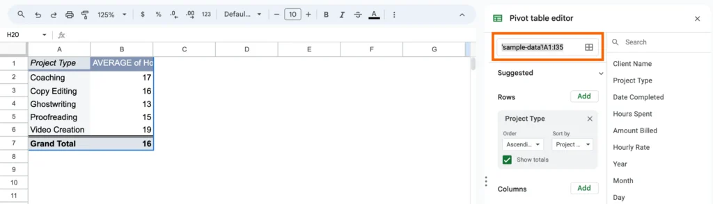
Averages
Averages help you understand typical performance. You can calculate the average sales, average marks, or average spending. This is useful when you want to measure consistency. For example, you can check the average monthly sales to track business stability.
Comparisons
Comparisons help you find differences between categories. You can compare products, months, or regions easily. For example, you can compare sales between two months. This helps you identify growth or decline in performance.
How to Customize a Pivot Table in Google Sheets
After you create a pivot table, you can adjust it based on your goal. You can control how data appears and how results get calculated. This helps you turn raw data into useful insights. You can customize your table using rows, columns, values, and filters. Each option changes how your data gets organized. You can mix these elements to answer different questions.
Add Rows
Rows group your data into categories. They appear on the left side of the pivot table. You can add fields like product, client, or category. When you add a field to rows, Google Sheets lists unique values. This helps you break data into clear groups.
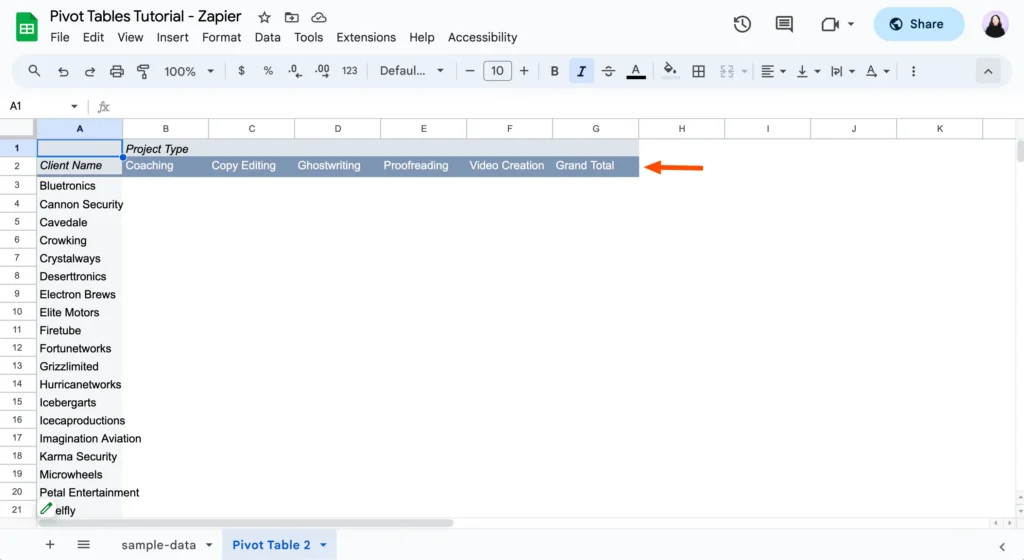
Add Columns
Columns organize data across the top. They help you compare values side by side. You can use fields like month, year, or type. Adding columns makes it easier to compare performance. You can quickly see differences between categories.
Add Values
Values calculate results from your data. This is where you get totals, averages, or counts. You can choose the calculation type based on your needs.
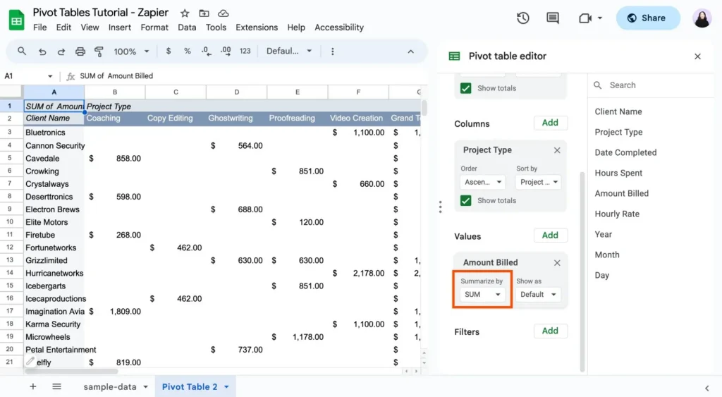
Common calculations include:
This step turns your grouped data into meaningful numbers.
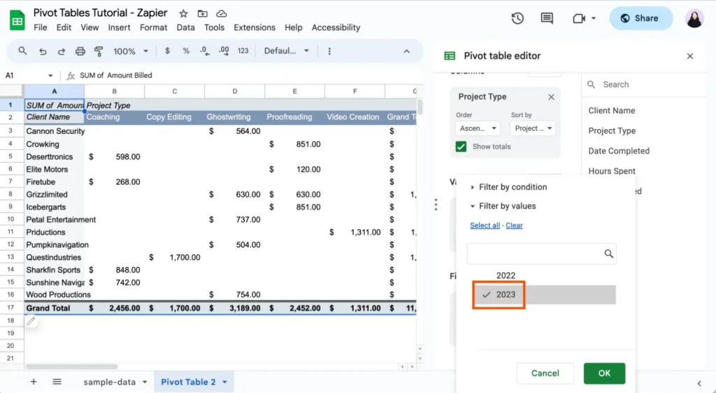
Add Filters
Filters control which data appears in your pivot table. They help you focus on a specific part of your data. You can filter by date, category, or any field. This allows you to analyze one segment without changing the full dataset.
How to Refresh and Update a Pivot Table
Pivot tables depend on your source data. When your data changes, you need to update the pivot table to see the correct results. This keeps your analysis accurate and reliable. Google Sheets often updates pivot tables automatically when you edit the data. If you add new rows within the selected range, the pivot table may reflect changes instantly. This makes it easy to keep your reports up to date.
In some cases, you may need to update it manually. This happens when new data falls outside the selected range or the table does not refresh.
You can handle updates in two ways:
To update manually, click on the pivot table and adjust the data range in the editor. This ensures all new data gets included in your analysis.
Common Pivot Table Mistakes
Small mistakes can break your pivot table or show wrong results. Many beginners face issues because they skip basic checks. If you avoid these errors, your pivot table will work smoothly.
Here are the most common mistakes you should watch for:
Wrong Data Range
Many users select the wrong data range while creating a pivot table. This can exclude important data or include empty cells. Always select the full data range with headers. Check your range carefully before creating the pivot table.
Blank Cells
Blank cells can cause incorrect calculations. They affect totals, averages, and grouping. Make sure your data has no empty rows or missing values. Clean your data before using it.
Misuse of Values
Values control how your data gets calculated. Using the wrong calculation gives incorrect results. Always choose the correct option based on your goal. This ensures your data stays accurate and useful.
Conclusion
Pivot tables help you turn large data into simple insights. You learned how to create, customize, and analyze data step by step. You also saw how to avoid common mistakes and keep your data accurate. With practice, you can use pivot tables to save time and improve your analysis. Start with simple data and explore more features as you grow. This will help you work faster and make better decisions.