How to Customize Looker Studio Reports (Step-by-Step Guide)
Many users struggle to make reports useful in Looker Studio. Default reports often show limited data and fixed layouts. This makes it hard to present insights clearly and effectively. Without customization, reports may not match your goals.
Customizing Looker Studio reports helps you control how data is shown. You can change charts, metrics, filters, and design based on your needs. This makes your reports easier to understand and more actionable. In this guide, you will learn how to customize reports step by step.
What Is Looker Studio
Looker Studio is a data visualization tool by Google. It helps you turn raw data into clear and interactive reports. You can connect data from different sources and display it in charts and dashboards. This makes it easier to understand performance.
It allows you to create custom reports based on your needs. You can add graphs, tables, and filters to organize data. This helps you present insights in a simple and visual way. Looker Studio is widely used for analytics and reporting. It helps businesses and marketers make better decisions using data.
Why Customize Looker Studio Reports
Customizing reports in Looker Studio helps you present data in a clearer way. Default reports may not show the exact insights you need. Customization allows you to focus on important metrics. This makes your reports more useful and easier to understand.
You can adjust visuals, layout, and filters based on your goals. This helps you highlight key data and remove unnecessary information, especially when preparing and organizing datasets using functions like VLOOKUP in Google Sheets. Customized reports also improve decision-making. They allow you to analyze data quickly and accurately.
Key Elements You Can Customize
You can customize multiple elements in Looker Studio to improve your reports. These elements help you control how data is displayed and analyzed. Proper customization makes your reports clearer and more useful.
Charts and Graphs
You can change chart types based on your data. Use bar charts, line charts, or pie charts for better visualization. This helps you present data in a simple way.
Metrics and Dimensions
You can select which data to display in your report. Metrics show numbers, while dimensions show categories. Choosing the right combination improves analysis.
Filters and Controls
Filters allow users to view specific data. You can add dropdowns, date filters, or search options. This makes reports interactive and flexible.
Layout and Design
You can adjust colors, fonts, and layout. A clean design makes your report easier to read. Good design improves user experience and understanding.
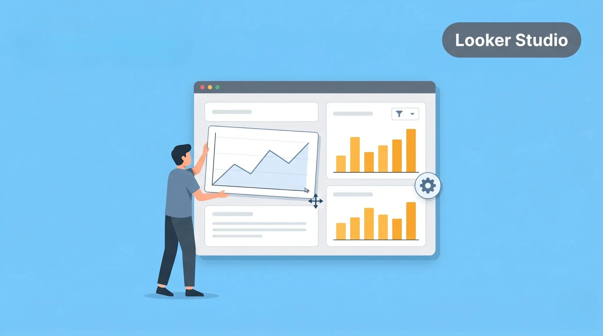
How to Customize Reports in Looker Studio (Step-by-Step)
You can customize your reports in Looker Studio using edit mode. This allows you to change charts, data, and design easily. Follow these steps to customize your report.
Step 1: Open Report in Edit Mode
Open your report and click on Edit. This allows you to make changes to your dashboard. You will now see editing options.
Step 2: Add or Edit Charts
Click on Add a chart to insert new visuals. You can also select an existing chart to edit it. Choose the chart type that fits your data.
Step 3: Change Metrics and Dimensions
Select a chart and update its data fields. You can change metrics and dimensions from the settings panel. This helps you display the right data.
Step 4: Add Filters and Controls
Add filters to make your report interactive. Use controls like date range or dropdown filters. This allows users to explore data easily.
Step 5: Adjust Layout and Style
Customize colors, fonts, and layout. Arrange elements to make your report clean and readable. A good design improves understanding.
How to Create Custom Dashboards
You can create custom dashboards in Looker Studio to combine multiple reports in one place. This helps you view important data quickly. It also makes analysis more efficient.
Start by adding multiple charts to your report. Use different visuals like tables, graphs, and scorecards. This allows you to display various metrics together.
You can connect multiple data sources to one dashboard. This helps you analyze data from different platforms in one view. A well-structured dashboard makes reporting simple and effective.
Best Practices for Custom Reports
Using the right approach in Looker Studio helps you create clear and effective reports. A well-structured report makes data easy to understand. It also improves decision-making and analysis.
Keep your design simple and clean. Avoid adding too many charts or unnecessary data. Focus only on key metrics that matter to your goals. This helps users quickly understand the report.
Use clear labels and consistent formatting. This makes your report more professional and easy to read. Always test your report to ensure data accuracy and usability.
Common Mistakes to Avoid
Many users make mistakes while customizing reports in Looker Studio. These errors can make reports confusing or misleading. You need to avoid them to create effective dashboards.
Adding Too Many Charts
Using too many visuals makes the report cluttered. It becomes hard to focus on important data.
Using Wrong Metrics
Selecting irrelevant metrics leads to incorrect analysis. Always choose data that matches your goals.
Ignoring Data Accuracy
If your data source is incorrect, your report will be wrong. Always verify your data before using it.
Poor Design and Layout
Bad layout makes reports difficult to read. Use proper spacing and alignment for better clarity.
Not Using Filters
Without filters, users cannot explore data easily. Add controls to make your report interactive.
Conclusion
Customizing reports in Looker Studio helps you present data clearly and effectively. It allows you to focus on important metrics and improve analysis. This makes your reports more useful and actionable. It also helps in better decision-making.
Use proper design, relevant data, and interactive elements. Avoid common mistakes and keep your reports simple. Test your reports regularly for accuracy. This approach helps you create powerful and professional dashboards.